CI concept
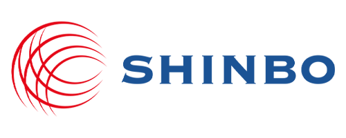
The symbols of the red arcs overlapping each other indicate the form of radio waves and the ambition to spread the new spirit of enterprise and new technology to the world.
The logo type is a square structure with the same width, showing reliability and stability, a virtue that defense companies should have. The basic principle is to use the English logo type, and the official logo should be vertical.
Vertical CI

Horizontal CI
CI Color Regulation
The colors used in Shinbo’s CI are very important elements that conveys the image of Shinbo along with the symbol mark and logotype.
The main color is red, which symbolizes innovation, challenge, and enthusiasm, while the secondary color is a dark bluecolor that symbolizes professionalism, stability and trust.
Red is used for emphasis, and dark blue is usually used.
RED
- RGB CODE237/45/47
- HTML Color#ED2D2F
- Innovation, challenge, passion
DEEP BLUE
- RGB CODE23/82/144
- HTML Color#175290
- professionalism, stability, trust